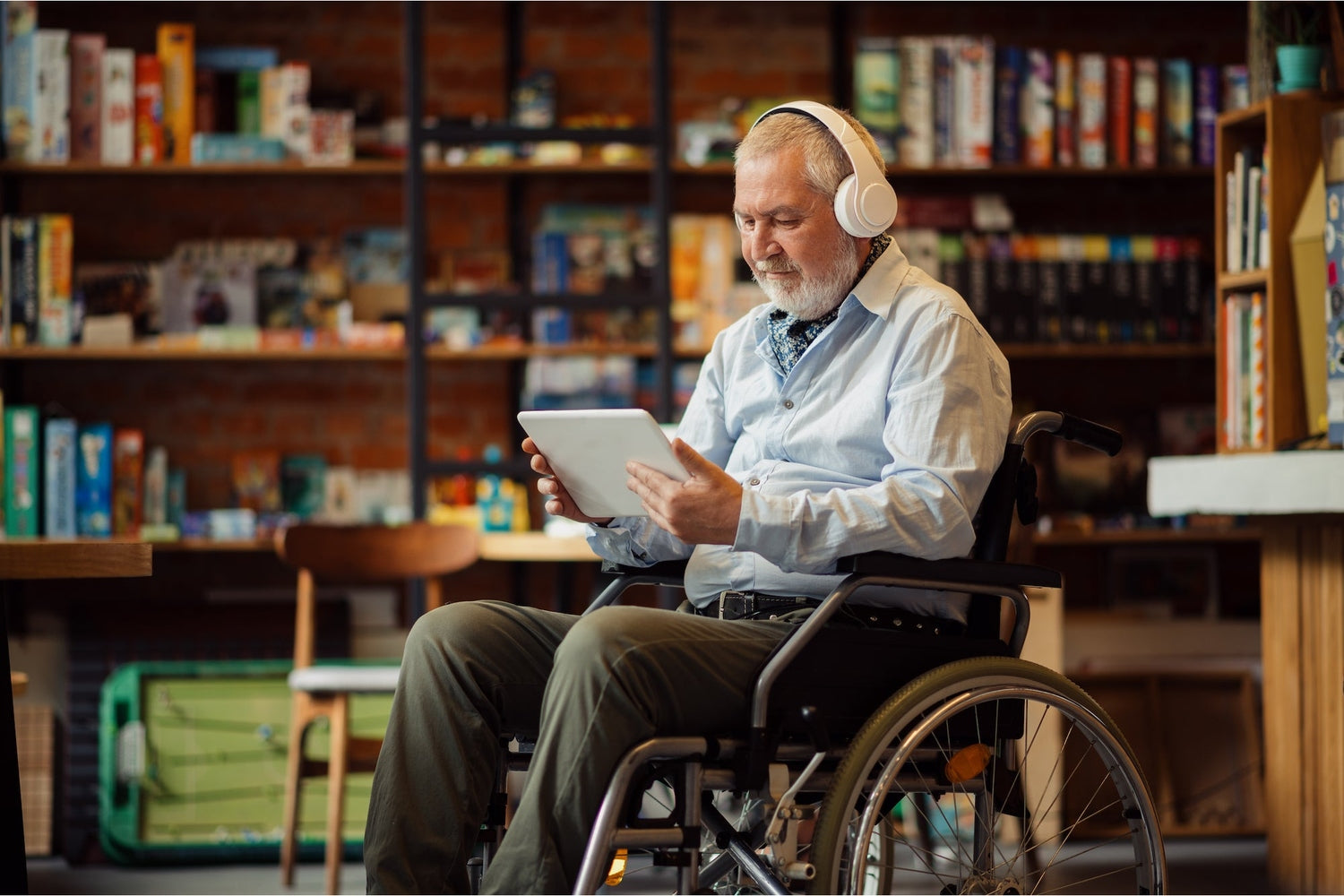
Have you ever wondered how a person suffering from some possible disability can access digital services on the internet?
Well, the answer can be summed up in a single keyword: Accessibility .
Very often, when developing a website, all the measures that ensure an impeccable and usable User Experience for any type of user are not taken into consideration.
This is an error that should not be taken lightly, as by 28 June 2025 all private companies with a turnover exceeding 500 million euros in the last 3 years are required to make their online services in line with the principle of accessibility.
So let's see what it is specifically and how to put it into practice.
What is meant by accessibility?
Accessibility is nothing other than the ability of digital tools to guarantee a service that can be understood and used by every type of individual . An accessible website also includes those who have disabilities that prevent usable navigation and therefore require assistive technologies.
We are talking about any type of handicap, be it auditory, visual, physical, neurological, cognitive or discursive.
According to the Stanca Law ( Law n°4 of 2004 ), however, the accessibility of websites is not only aimed at disabled people, but welcomes any type of user, having the possibility of conveniently accessing digital contents.
Let's take into consideration, for example, older people, who are unable to use their smartphones easily, or anyone with a temporary limitation situation, or even those suffering from a temporary disability, and so on.
Despite this, however, there are many companies that still do not give weight to this very fundamental and, before long, mandatory issue.
But why is it so important to have an accessible website?
We assume that not all people have the ability to use computer systems without experiencing any problems.
We are not just talking about disabled individuals, as already mentioned, but also about older people, for example, who must adapt to new digital changes.
Therefore, it is essential to be of their support in order to guarantee a perfect experience and navigation.
In this way, not only would we be of great help to others, reducing difficulties and improving autonomy, but we would also allow an improvement from a commercial point of view, increasing the number of visitors, building customer loyalty and increasing revenue.
Therefore, by offering a service and easy access for everyone, you will be able to collaborate to give anyone the opportunity to adapt to technological changes, breaking down discrimination and inequalities.
How to make your site accessible
Before starting, it is useful to understand why our website is NOT accessible.
To do this we must ask ourselves some fundamental questions, including: is my site capable of guaranteeing an impeccable User Experience for anyone?
Is the content made available easily understandable?
Am I able to navigate from one page to another only using the keyboard?
If the answer to most of these questions is negative, then I recommend you continue reading to understand how you can improve.
The W3C ( World Wide Web Consortium ) and the WCAG 2.1 ( Web Content Accessibility Guidelines ) have defined some particular guidelines to satisfy the accessibility requirements of the web, thus creating a shared and unique standard to be respected in order to overcome the barriers of disparity.
The principles of accessibility are summarized in 4 points:
- Perceivable / perceivable : every individual has the right to perceive and understand the contents of a website.
- Operable / operable : each content must also be accessed via keyboard.
- Understandable / understandable : the information present must be easily understood.
- Robust : Content must be able to be interpreted by programs and assistive technologies.
So, what characteristics must a website have to comply with the principles of accessibility?
- Readability : Make the text as readable as possible. To do this, remember to use colors that create contrast (a light background and a dark font) and equally understandable fonts, in order to ensure easy and smooth reading.
- Responsive design : make sure that your site adapts graphically to any type of device, therefore both on mobile and desktop. This is a factor that should not be underestimated, as most users nowadays prefer browsing on smartphones.
- Usability : meets accessibility requirements by making all contents usable, both from a textual and graphic point of view. Plus, it creates a linear and understandable web architecture, so that users can easily find what they're looking for.
- Alt Tag : This is a phrase that is added into the HTML code to describe an image. In this way, a person with a visual impairment can access this graphic content thanks to a screen reader that will speak the alternative text assigned to the image.
- Subtitles : It's important not to forget to add subtitles to your videos. By doing this everyone will be able to understand the topic covered.
- Highly visible links : Make your links functional and recognizable by using contrasting colors.
Obviously these are just some of the many precautions to take into consideration.
If you want to know more about the topic and receive information about it, ask Gilbi.co for help.
We are waiting for you!


Leave a comment
All comments are moderated before being published.
This site is protected by hCaptcha and the hCaptcha Privacy Policy and Terms of Service apply.